Screen + Sound + Stage
Text by Prachi Sibal. Photographs by Rose Tommy.
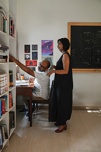
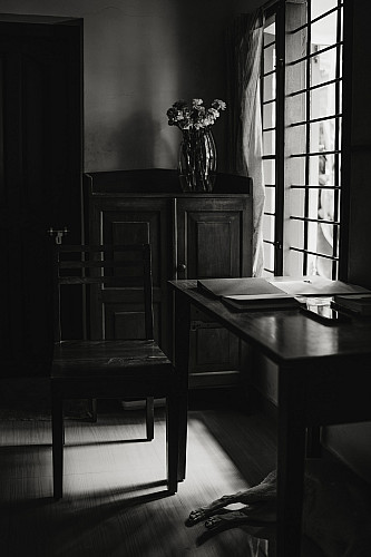
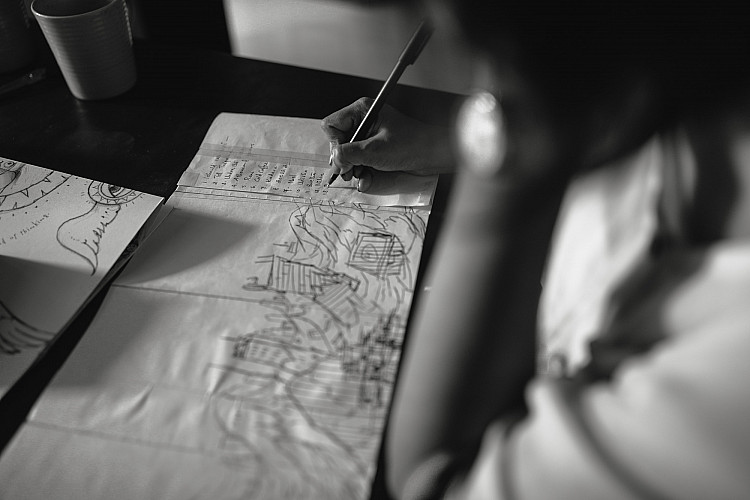
Tina and Pratheek Thomas at their workspace in their Kochi home.
Tina and Pratheek Thomas were born on the same day, four years apart. And this is just one of the many coincidences that ties them together. Both storytellers at heart, the two first exchanged glances while furiously scribbling away in their individual notebooks on a train journey from Bengaluru to Kochi in 2010. At the time, she was writing a script for a television show, he was working on a comic book. They would get married in the following year.
By happenstance, their small venture, a comic book publishing house, was launched on February 14, 2014. They called it Studio Kokaachi, after a not-so-beloved monster that is part of Malayalam folklore — and who they were introduced to as children. Both Tina and Pratheek maintain that the kokaachi has been misrepresented in popular culture and, in reality, is not a scary monster as it is commonly believed. And they have taken it upon themselves to spread word about this little-known aspect of the imaginary monster’s personality.
The kokaachi monster forms the logo for Studio Kokaachi.
Studio Kokaachi isn’t Pratheek’s first brush with the world of comic books. A comic book fan through his childhood years, he graduated from NID (National Institute of Design), Ahmedabad and went on to work at ISKCON (International Society for Krishna Consciousness) in Bengaluru. “I was working with the design wing and was involved in a project pertaining to country-wide theme parks that were to have Krishna as a central character,” he says. An unfortunate layoff and months without a job back in 2008 led him to embrace his first love, storytelling.
Manta Ray Comics — a partnership with friend and fellow comic book nerd Dileep Cherian — was thus born, with its first book Hush coming out in January 2011. “My brother is an ad film-maker and he had an idea for a short film. I wanted to adapt it into a comic so he could pitch it to producers,” Pratheek says about the first title.
In 2012, when Tina was working at Wipro in Bengaluru, she recalls Manta Ray being “like the baby at home”. Her first comic strip appeared in The Small Picture, a weekly contribution by Manta Ray Comics in Mint, in the same year. Commenting on social and cultural issues, it ran for more than three years.
The cover of Mixtape Vol. 2 that was republished by Studio Kokaachi in 2014.
Incidentally, it was with this outing that Manta Ray first gathered acclaim; helmed by Cherian, it stood out particularly for its simplistic out-of-the box themes and artworks. In a market saturated with mythological and superhero tales, this was genre-bending.
Manta Ray published Mixtape Vol. 1 in April 2013 — it comprised four individual black-and-white graphic narratives, illustrated by a mix of upcoming and well-known artists. Each was priced at a mere 55 rupees for the digital version. Mixtape Vol. 2 — in a similar format — followed at the end of the year: the outcome was five short stories revolving around eclectic narratives; these included a man chasing a pickpocket, a biting satire on social media and a tale of love gone wrong.
But the couple soon realised that creating and publishing comic books isn’t easy money. It did, however, lead them to a different — and more lucrative — industry, one that they had never imagined trying their hand at.
Onto The Silver Screen
Left to Right: the Mixtape series; a collage of frames from the animated sequences in the 2015 Tamil film OK Kanmani and its 2017 Hindi remake OK Jaanu.
The launch of Manta Ray’s Mixtape Vol. 2 at Malayalam film-maker Aashiq Abu’s Cafe Papaya in Kochi led to an offer by Abu, who was keen on collaborating with the duo for his 2014 Malayalam film Gangster. Calling themselves Studio Kokaachi now, their first steps into the world of films led to a whopping 11 minutes of animation that covered the prologue and the climax.
“Aashiq Abu also wanted us to write screenplays for a new project. It didn’t end up happening but we had already moved to Kochi from Bengaluru, to work with Abu,” recalls Tina. Studio Kokaachi’s first comic Mixtape Vol. 3 would only be published in October 2016. This would be followed by An Autobiografly, an autobiography of a housefly, and the accordion-style Matchbox Comix Vol. 2. The large gaps between releases is attributed to their ventures being self-funded.
For Mani Ratnam’s Tamil film OK Kanmani (2015), Studio Kokaachi created both 2D and 3D animated game sequences that supported the protagonist’s — a gamer — character arc as well as the 2D end credits. For the Hindi remake OK Jaanu (2017) the 3D sequences were done in collaboration with Splat Studio, and the 2D sequences with Dreamcatcher Studios, while the opening credit sequences were created in collaboration with Plexus Motion.
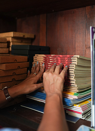
A work in progress: pages from Sound Of Her Silence, one of the stories in the yet-to-be-released Mixtape Vol. 4.
Soon after, actor Neil Bhoopalam discovered Mixtape Vol. 1 at a cafe in Goa. He showed it to director Akshat Verma, who was interested in making a graphic novel based on their upcoming film, Kaalakaandi (2018), also starring Saif Ali Khan, as publicity material for it. Although it did not materialise, Studio Kokaachi was roped in for the film’s title sequence in 2017.
Breaking Into OTT
Gully Boy (2019, on Vimeo): the opening titles by Studio Kokaachi
Tina and Pratheek stepped into the OTT title credits space with Lust Stories, the 2018 Netflix anthology produced by Ronnie Screwvala’s RSVP Movies and Ashi Dua’s Flying Unicorn Entertainment. Since then they have created the title credits for six more productions for Netflix — the Tamil limited-edition anthology film Paava Kadhaigal (2020), the Hindi-Telugu bilingual Pitta Kathalu (2021) and the Hindi-language productions, Ghost Stories (2020), Ankahi Kahaniya (2021), Ajeeb Dastaans (2021) and the recently released Lust Stories 2. “For both the Lust Stories, we used elements from the various films and stitched a narrative for the title credits. We tried to evoke the mood — the world and the characters are what we can play around with. Paava Kadhaigal comprises four short films about honour killing and the title credits give you a glimpse of the mood that lies ahead. The films were very dark. The opening credits feature the journey of a woman from birth to motherhood. We connected all the illustrations using the colour red. Red plays an important part in a girl’s life — from menstrual blood to sindoor and the wedding sari,” says Tina.
Film-maker Zoya Akhtar initially reached out to them to animate the logo for Tiger Baby Films, her production house that was launched in 2019 with Gully Boy, and then asked if they would do the title sequence for the film as well. “When we got called for Gully Boy we did not realise how big it was,” says Tina.
Left to Right: a shortlist of title fonts for Gully Boy; the ideation notebook for the film’s title sequence.
From animated sequences in OK Kanmani and Abu’s Gangster to animated typography in Gully Boy, their repertoire was steadily expanding. Gangster had a graphic novel-inspired style. OK Kanmani has stylised, game sequence-like animation. Lust Stories has a minimal design style. They’ve also done the animated logo for a Hollywood studio that hasn’t been released yet.
Despite the increase in the scope and quantity of their work, Studio Kokaachi is still just made up of Tina and Pratheek. Graphic designers, illustrators, artists and animators come on board based on the demands of the projects they take on. Their office premises have remained shut since the pandemic. The couple now works out of their home where they live with their four rescue dogs. “Both of us are writers and storytellers, we are not illustrators or animators. We conceptualise, write and provide the necessary direction to the projects, and collaborate with animators and artists for the rest of our needs,” says Pratheek, adding that they have gone from working with animation studios to now also handpicking freelance artists for specific projects now. “We work with studios or freelancers based on the volume of work. OK Kanmani and Gangster were exceptions where we were going beyond our mainstay — title credits — and creating longer animation sequences. We needed studio support to render them within our three-month deadline.”
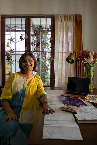
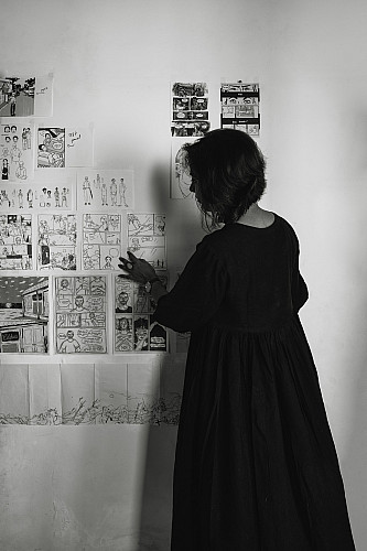
Tina with sketches for A Thousand Years, an upcoming comic book.
Standing Out In The Clutter
Cracking a concept for a film or series remains their biggest challenge and can take weeks. Not everyone wants animation in the title sequence or is willing to share footage from the film for the same. “For The Empire, the Disney + Hotstar web series, we presented 10 concepts, and all of them were rejected by the makers. We had run out of ideas and then at midnight, I wrote down the word “Empire” on a blackboard. The word has six letters and there were six Mughal emperors. It was like an epiphany,” says Pratheek about the credit sequence where silhouettes of the faces of six Mughal emperors turn to reveal the title of the series.
Studio Kokaachi hopes to veer in a new creative direction with every project, but they choose to steer clear of live action. The credits for the Indian Modern Love anthologies, which premiered on Amazon Prime in 2022, played with stock images, while those for Rocket Boys (2022-’23) were hand-drawn with minimal animation, a huge departure in style from their earlier work. “We don’t have the skill set for live action and it makes no sense for us to outsource it,” he says. “The other challenge is dealing with production houses that come to us without understanding the limitations of our field. For example, given that they were hand-drawn, we could replicate Jim Sarbh and Ishwak Singh’s facial features only to a certain extent,” they say, referring to the Rocket Boys opening credits.
But this SonyLIV web series turned out to be their big break. “With Lust Stories, people noticed us but we didn’t get calls for too many projects. But when actors began to tag us on social media after Rocket Boys, there was a sudden explosion of interest,” Pratheek explains. Their work had now reached critical mass.
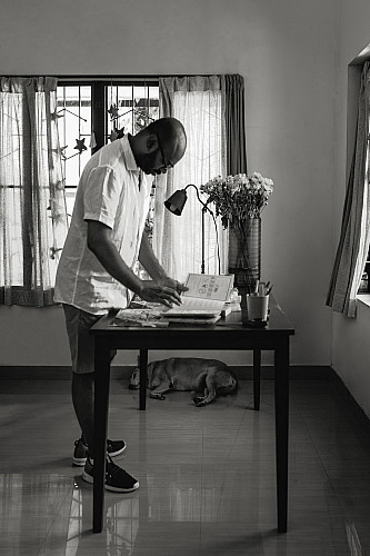
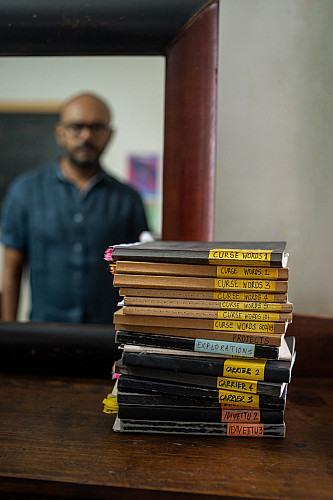
Left to Right: Pratheek at work; his writing desk.
“We don’t quite know how it happened but we have somehow become synonymous with title sequences. We are not in Mumbai. We don’t go out and pitch. We are not very active on social media –– we are not even on WhatsApp,” he says, adding that the conceptualisation and execution of title sequences as mini films are in sync with their basic skill set as storytellers.
In their seventh year of creating title sequences, Studio Kokaachi is awaiting the release of their 25th project, Pippa, a film set during the 1971 Indo-Pak war. Then there’s Shiladitya Bora’s Bhagwan Bharose, the 25th UK Asian Film Festival’s closing film, which bagged the Best Film award in May. “We’ve also created an animated logo for Earthsky Pictures (Ashwiny Iyer Tiwari and Nitesh Tiwari’s production house),” says Tina.
The Art Of Credit Sequences
Pratheek’s page layouts for Hush.
Title sequences in Indian films have incorporated — from animation, handwritten slides and catchy music for aeons now. They have been a way to keep audiences entertained.
In earlier times, the tone, music and text often conveyed the emotion of the upcoming film and prepared viewers for what was in store. “I personally prefer credits where a little bit of the movie is shown. It captures the interest of the viewer,” says Bollywood buff Dhruv Somani. Earlier, he says, viewers wouldn’t mind missing the end credit sequences but with film-makers choosing to run elaborate end credits in recent years, this is no longer the case. “In Bollywood, this is also where you would sometimes find the hot-ticket number that is popular with the masses,” chimes in Puneet Rakheja, who used to run the blog Taking Credit in 2013-’14, with the aim of decoding credit sequences in films.
“Though it’s not recognised by the Academy yet, the title sequence is an art form in its own right. The opening credits are the first visuals you meet in a film. They can perform various roles — as a narrative device that pushes the story along, an introduction to the characters and big-ticket actors, and so on. Lately, some are using these title sequences as a way to pass on subtle clues about an anticipated plot; for instance, in Game of Thrones, at the height of its fervour, there were plenty of blogs and videos devoted to the now iconic title sequences,” adds Rakheja.
The credit sequences in Bollywood films and OTT series largely remain in English, with the name of the films being spelt out in Hindi and Urdu at times. Down South, the credits have always been displayed in the native languages. “In Kollywood, all the credits would appear in Tamil and only the names of the key cast and crew would be mentioned in English. The background music is often punctuated with dramatic silence for big names like, say, K. Balachander,” says film-maker and academic K. Hariharan. He believes simplistic titles are the way to go and brings up Sholay (1975) as an example, for its use of basic title cards — names handwritten on cards and photographed — that were far from ornate and yet effective. “There is no ideal credit sequence. There are effective or ineffective title sequences,” points out Rakheja.
And standout sequences have stayed with audiences through the years.
In the 1978 Amitabh Bachchan-starrer Don, the pre-credits scene has him throwing a briefcase at the goons. It explodes and leads us to the credit sequence, which opens with a fight. Presented as coloured film negatives, the credits, accompanied by the theme song, set the tone for the high-paced chase that is about to follow.
Shivendra Singh Dungarpur, film-maker, film historian and founder of the Film Heritage Foundation, cites the example of the 1966 film Teesri Manzil where the opening credits end with a woman falling off the third storey of a building in an effort to build suspense.
“The earlier title sequences mostly made use of title cards. The 1936 Devdas used an art deco typeface – that was popular then – against a black background. In the 1955 version, the credits appear as the pages of a book are flipped,” says Rakheja. “The remarkable expressionist frame of a pair of eyes and a dozen hands in the 1957 film Do Aankhen Barah Haath was striking; the opening sequence uses 12 handprints as a canvas for the credits.”
Somani recounts the presence of background music in the credits of black and white films of the ’50s. “When Eastmancolor came into the picture, title credits became more eye-catching. The ’80s saw some of the most memorable sequences thanks to Nasir Hussain, Hrishikesh Mukherjee, Raj Khosla and the Ramsay Brothers,” he says.
A double spread from Hush.
The credit sequences were often employed to create an atmosphere of suspense. “Those for low-budget horror films by the Ramsay Brothers brought with them a certain curiosity and evoked a mood that would lead viewers into the film without bringing in any elements of gore. Raja Nawathe’s 1965 thriller Gumnaam, on the other hand, had blood splattered across the screen, blatantly denoting a sense of mystery,” he says.
Fast-paced sequences with appropriate music were for thrillers and horror while animation was reserved for comedies. In Sai Paranjpye’s Katha (1983), the credit sequence tells us of the hare-and-tortoise fable with hand-drawn illustrations. It sets a comic tone and remains a thread through the film, reoccurring at the end.
The Effects Of Digitalisation
The digital age that set its stamp on the 2000s saw a new sophistication creep into title sequences. The production value was better and music was sometimes commissioned especially for the credit reels. According to Rakheja, there has also been a shift towards creating larger-than-life imagery. He cites Baahubali 2: The Conclusion (2017) as an example; it used its title credits as a plot device that gave viewers a glimpse of key events from the previous film. “Its title sequence animated scenes from the first film which lent them a larger-than-life feel,” he says.
From the ’90s onward, there were only a handful of references that they talk about. “In recent times, Farah Khan started the trend of creating end credit sequences that the audience would stay back to watch, we see it in Main Hoon Na and Om Shanti Om,” says Somani, referring in particular to the latter, where several of the cast and crew, including technicians and spot boys, make an appearance. The sequence closes with the grand entry of the director in an auto. It was a tribute to the cast and crew of the film that tips a hat to the glory days of the Hindi film industry.
The end credits of Zoya Akhtar’s Luck by Chance (2009) also made a mark for its innovation. The credit reel that the film closes with features a single long shot of Konkona Sen Sharma in a black-and-yellow taxi, with the city of Mumbai in the backdrop. From a starkly different genre, Anurag Kashyap’s Gangs of Wasseypur (2012), with its rugged, textured title cards, and Black Friday (2004), where the title of the film foregrounds the smoke-filled images of the 1993 Bombay blasts, are equally memorable.
A rough sketch from A Thousand Years.
Then there’s the flip side to digitally produced credit sequences. While embracing the digital tools available to create innovative and high-quality titles, most critics admit that the personal touch is slowly disappearing. “All credit sequences have started looking the same. The artistic interpretation is lost. Since it was not an easy job earlier, everyone thought of innovative, original ideas to make them stand out,” Dungarpur says. “It’s the same with film posters, you can’t match the hand-drawn ones from the early days. Also, when was the last time you saw a film’s interval being announced with a bang?” says Dungarpur, who has been maintaining a personal archive of the ending shots — specifically, “The End” frames –– of Indian films.
The Resurgence
Left: Tina assesses rough sketches from Mixtape Vol. 4 and A Thousand Years.
A significant trend that has emerged with OTT films and series is the outsourcing of credit sequences to studios and producers beyond the silos of film circuits. With OTT platforms coming up with new releases every week and competing for audience attention, the pie is becoming larger and there’s a piece for everyone.
As a result, a number of VFX agencies have sprung up. Mumbai-based Plexus Motion, best known for their title credits for both the seasons of Netflix’s Sacred Games (2018-’19), Gangs of Wasseypur and Angry Indian Goddesses (2015), was also born in 2014. More recently, Koffee With Karan (2004-’22) outsourced its credit sequence to the Chennai-based Whoa Mama Design. Mumbai-based Harkat Studios, launched in 2017, has created title sequences for Bombay Begums (2021), Trial by Fire (2023) and Guns and Gulaabs (2023), all of which are viewable on Netflix.
“We’ve done credits for two Tamil films but they were over six years ago. Dharma Productions got in touch with us after happening to see our brand videos and edits on social media. They were taking a chance,” says Shaun D’Sa, co-founder and creative head, Whoa Mama Design. He adds, “Karan (Johar) liked the concepts that we shared. He was keen on a red-carpet scene. We worked on the storyboard, scripts, choreography and set design, and shot the sequence at the YRF Studio in Mumbai.”
The early work of Vijesh Rajan, before he founded Plexus Motion, includes Gangs of Wasseypur, OK Kanmani, and MTV India’s The Dewarists (2011-’16) and Bring on the Night (2012). With Plexus Motion, he went on to produce atmospheric title sequences for yet another Kashyap film Raman Raghav 2.0 (2016), besides miniseries like Ghoul (2018) and Leila (2019).
Rajan’s approach to Gangs of Wasseypur was novel and attempted to give a touch of a Western, albeit in the heartlands of India. “I saw so much grit and texture on set. I wanted the sequence to reflect that and the credits set up the tale of the place and the people. The music had to indicate that it is a dangerous place to be, that the people are dangerous. We decided to go with a large textured typeface,” he says, recalling how they would rub sheets of paper with the title text on the ground for the rugged, aged look. “We would crumple paper and then scan it. For over 10 days, at Kashyap’s office in Mumbai, we were just rubbing paper across different surfaces to get the right texture. No two frames looked the same or had the same texture,” he shares.
“When Plexus was working on Netflix’s Decoupled, the directors came with a brief that clearly stated the need for something fresh for each episode. When a couple splits up, it’s not just them, all their belongings get split up too. We came up with eight executions of the title sequence. A different object in the opening credits of each of the eight episodes alludes to the separation by moving away from its counterpart,” Rajan adds.
Sacred Games, another early piece of work by Plexus, received rave reviews for the music — by Alokananda Dasgupta — employed in its title credits. Here, the mandala and the haunting music creates a palpable tension. “Each episode has its unique mandala with elements from Hindu mythology embedded in it. It is colourful to begin with and then the colour starts to fade away. It signifies the underlying darkness that is unleashed as the storyline progresses. We were told it needs to have some angst. That’s when we started doing these sharp edits,” he says of the thinking behind the sequence.
With the series, Rajan’s team tried to beat the system; specifically, the Skip Intro option on OTT platforms. They achieved this by creating title sequences that changed with every episode, a stratagem that they would replicate for Decoupled in 2021. The Skip Intro feature works against the animation artists. It also creates a new set of challenges, of bringing in variety with each episode. Lending the right amount of drama to the titles is critical; they should not overshadow the actual content or reveal spoilers. Titles appear at a faster speed nowadays — you can look up the credits online and hence the titles serve a more aesthetic and less functional purpose now. Nevertheless, Rajan believes that engaging credits are here to stay. The skip option on OTT platforms may not be a deal-breaker. “It pressurises studios to be more creative,” he says.
Surging Ahead
Studio Kokaachi’s journey with credit sequences and comic books isn’t going to end anytime soon. Their first Malayalam comic series, the upcoming eight-part Idivettu, is “a heist story”, Pratheek says excitedly. “It’s about a boy who comes from a lineage of thieves and wants to grow up to be the greatest thief in the world. He becomes a thief but he isn’t very good at it. When another smarter, more successful thief shows up, he is forced to go to extraordinary lengths to prove himself as the best thief in his small town,” he adds, while trying not to reveal all of the twists and turns in the book.
More than nine years after they reclaimed the scary boogeyman of their childhood, the duo is setting the record straight. Another upcoming comic, There’s No Such Thing Called A Kokaachi, revolves around the monster. “The upcoming book has been scripted and the illustrations are being worked on. We are aiming for a mid-2024 release,” she adds.
There’s also Raja, a comic book that Pratheek and Tina are writing together for the first time. “The 40-page graphic narrative is inspired by Pratheek’s maternal grandmother and her dog,” says Tina, adding that it is slated to be unveiled in two months’ time.
Over the last few years, their lives may have taken a more filmi turn than they had chalked out for themselves — they still can’t quite wrap their heads around it – but the two insist that Bollywood demands notwithstanding, they are publishers and storytellers first. Upcoming OTT projects aside, Mixtape Vol. 4, they remind us, is waiting to be born.
